Mellow Market - @TradingView Chart color scheme
Introducing the Mellow Market @TradingView color scheme - a soothing and eye-strain free palette perfect for charts. With the help of AI, I created a beautiful combination of colors that enhance readability and reduce fatigue.
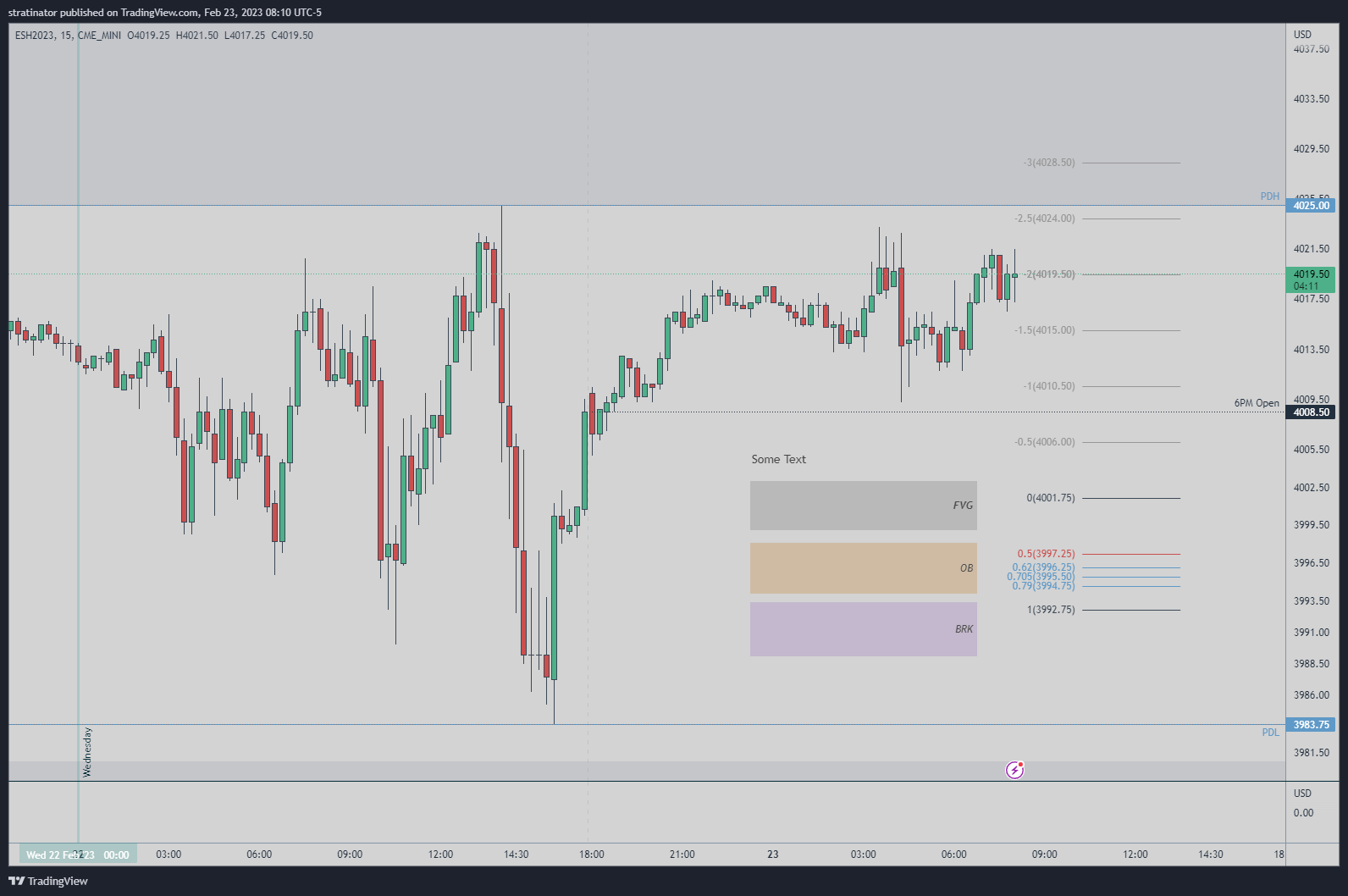
Mellow Market is a calm and soothing color scheme for charts, designed to prevent eye strain. The light grey background is complemented by soft, relaxing shades of green for upclose/bullish candles and a harmonious tone of red for downclose/bearish candles. The wicks and borders are a deep blue-grey, providing a good contrast while remaining easy on the eyes.
When it comes to drawing rectangles and lines on the chart, a soft, light yellow color complements the scheme nicely, adding a touch of contrast without overwhelming the soothing atmosphere. For text, a dark grey tone harmonizes perfectly with the background, providing good contrast without causing eye strain.
Here’s the list of colors for the Mellow Market scheme, including the complementary colors:
- Background: #D3D3D3 (light gray)
- Upclose/Bullish candles: #4DB089 (soft green)
- Downclose/Bearish candles: #CC4F4F (soft red)
- Borders and wicks: #1E2831 (dark gray-blue)
- Rectangle/Lines: #A5C3D9 (soft blue) and #9B9B9B (dark gray)
- Text: #4F4F4F (dark gray)
Complementary Colors:
- Complementary to #4DB089: #498AA0 (soft blue-green)
- Complementary to #CC4F4F: #B98484 (soft pink-red)
In summary, Mellow Market is the perfect color scheme for traders who seek a calming, soothing environment in which to work.